
Trashy
Data
What did we recover?
This page is largely about data visualization. Here, we draw from our detailed spreadsheet of recovered items from the Spring 2025 campus move-out at the University of Tennessee, Knoxville.
Altogether, we recovered nearly 10,000 items in Spring 2025 (although about 2,500 of those were Q-tips!). We are still cleaning the dataset. The next phase includes plans to estimate greenhouse gas emissions associated with the recovered items using the the EPA’s WARM v16 model and scale those estimates up across the University of Tennessee campus.
Chris also conducted approximately 30 interviews during move-out. Future publications will draw on these interviews alongside object stories that situate discarded items in time and place, thereby contextualizing waste as a social, material, and institutional phenomenon. Future plans include an ethnography of campus waste patterns and systems.
For now, though, below you'll find a word cloud, a bar chart, and frequency counts of the most common item types and material types.
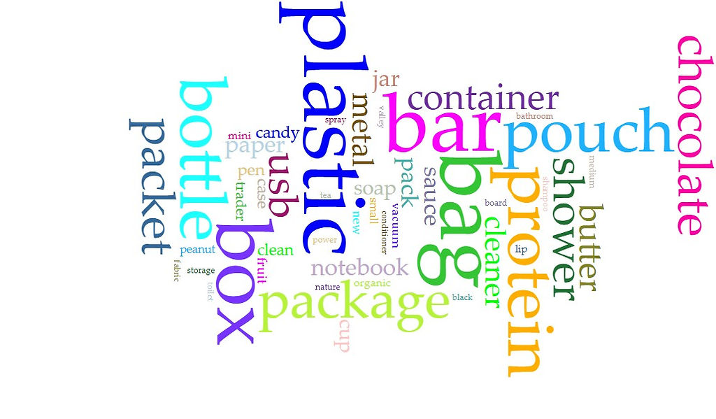
Word Cloud
A word cloud is a visual display of text data in which words are sized by how frequently they appear, helping viewers quickly spot prominent themes or patterns.
Word Cloud Methodology
This word cloud was created in Voyant Tools from a dataset of recovered items. To prepare the data, the item-name column was separated from the rest of the spreadsheet and converted into a clean text list for analysis. The aim was to ensure the visualization reflected item types and meaningful descriptors rather than packaging language, transcription artifacts, or product-label conventions.
Because word clouds are based on raw word frequency, the text was cleaned in two passes to reduce high-frequency “noise.” The first pass removed non-descriptive terms common in product names (such as measurement words and generic placeholders like oz, ounce, gram, and brand). Once those were removed, a second pass eliminated frequent but low-information modifiers—especially size, color, and mixture/state terms (such as size, large, white, black, mix, and dry) that can dominate counts without adding much interpretive value.
Some multiword names were standardized with hyphens so they would appear as single terms in the cloud (for example, Nature Valley → Nature-Valley; Trader Joe’s → Trader-Joe’s), and transcription artifacts from voice dictation (such as uh) were also removed.
A small number of common words were intentionally kept when they served as shared head terms across many compound names. For example, butter appears often largely because of phrases like almond butter, peanut butter, and shea butter. Keeping butter visible preserves a real pattern in the dataset. After these steps, the cleaned text was entered into Voyant Tools to generate the final word cloud, highlighting recurring object types while reducing misleading frequency effects.


Trashy Tokens and Frequencies
A token is a single unit of text (usually a word) created by splitting item names into their component terms (e.g., plastic storage bin becomes the tokens plastic, storage, bin). A token by frequency chart simply counts how often each token appears across the dataset.
Looking at frequency is informative because it quickly shows which materials, packaging forms, object types, and product terms recur most often. These can sometimes reveal patterns that are difficult to see when scanning hundreds of individual item entries.
The chart below shows the 21 most common tokens by frequency. What does this suggest about university move-out waste?

Dumpster Materials & Packaging
“Trashy Tokens” versus “Dumpster Materials & Packaging”
How do they differ?
“Trashy Tokens” counts every word (token) that appears in the item names – whatever volunteers happened to dictate or type – so it’s broad and open-ended. It answers: What words show up most often across the whole dataset?
“Dumpster Materials & Packaging” counts only a pre-selected set of keywords that relate to – you guessed it – materials and packaging – and measures how many item rows contain each keyword at least once. It answers: How often do item names explicitly mention materials or packaging forms like plastic, bag, box, bottle, metal, paper?
Below, the frequency by material list counts how many item-name rows contain selected keywords that signal either materials (e.g., plastic, metal, paper) or packaging/container forms (e.g., bag, box, bottle). Each keyword is counted once per row if it appears in that row’s item name. That’s why plastic and bag can both appear here: they describe different dimensions of the same object (what it’s made of vs. what form it takes).
What the top terms represent
The top five keywords (plastic, bag, box, bottle, package) occur across 193 rows. That’s about 20.6% of the 938 entries in the dataset. In other words, roughly 1 in 5 recorded item names explicitly mentions one of these common material/packaging markers.
Two useful ways to slice the table
1) Materials vs. packaging language
-
Packaging/container terms appear in 217 rows (23.1%)
-
Material terms appear in 98 rows (10.5%)
-
Both together appear in 21 rows (2.2%)
2) “What dominates” within each group
-
Packaging leaders: bag (45), box (40), bottle (36)
-
Material leader: plastic (54), far ahead of metal (15) and paper (13)

